20 changes in version 4

Version 4 of our iPad app is all about accessibility and preparing for the future, while keeping the same core experience you know and love. If you’d like to read more about the update and why we’re making the changes, take a look at our ‘Building a brand new app’ article here. If you have any questions around the release itself, you can find our developer Q&A here.
In this article we’re taking a deeper look at everything that’s changing in version 4, so if you want a comprehensive look at the tweaks and new features we’ve added, you’ve come to the right place.
1. New config screens
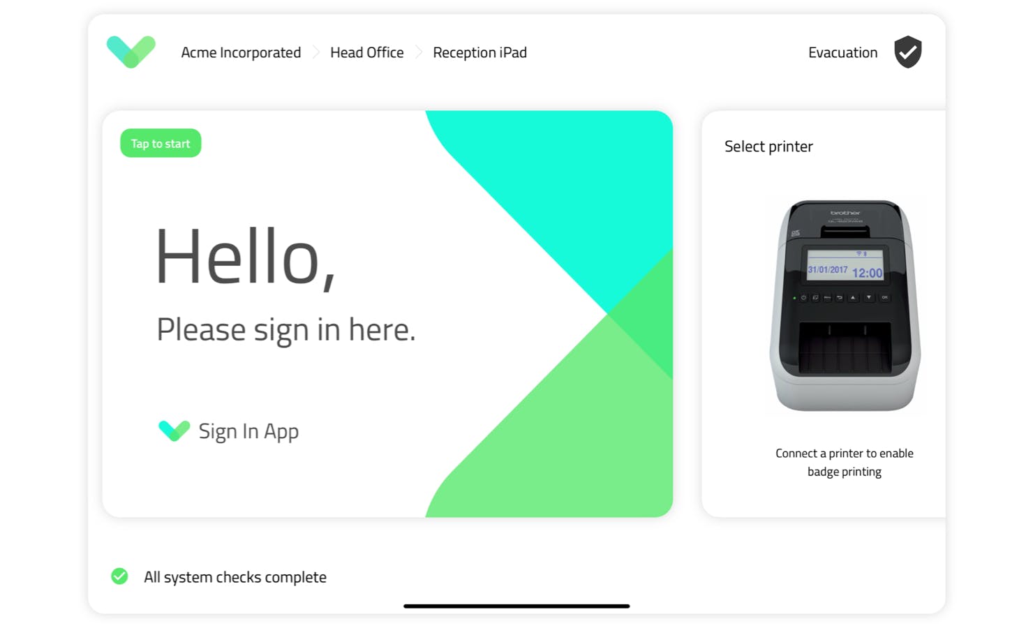
Version 4 of Sign In App starts with new and improved config screens when you first open the app. While the options themselves look familiar, they now show more information than before. Simply swipe left to scroll through the options and tap to make changes. At the bottom of the new config screen a status bar will let you know if there’s a problem, such as a printer being offline or a file that’s still being downloaded.

2. Evacuation report
At the top right corner of the new config screen, you’ll find our improved evacuation list which takes some of our best features from Sign In App Companion and brings them to the iPad. Evacuation reports can now be timed, include comments and be shared as a PDF when you’re done. You can view the report either by group or evacuation point and a handy summary screen counts the number of people accounted for as they’re checked off.
3. Quick access menu
If you’ve used Sign In App for any length of time, you’ll know that tapping and holding your finger on your welcome screen takes you back to the config screen. In version 4 we’ve made this easier to do with a countdown showing you how long to hold your finger. You’ll also see some options pop up in a mini-menu, allowing you to download the latest settings from the portal or reprint a badge without leaving the welcome screen.
4. Accessibility improvements
Sign In App is used to sign in guests and residents across all ages, industries and technical abilities. We’ve always had great feedback about how easy the app is to use, but with version 4 we wanted to improve our accessibility even further. Throughout the app, fonts are larger and easier to read at a distance, while buttons are clearer and easier to tap. Feedback during the beta from organisations with visually impaired guests has been encouraging and we’re excited to push accessibility further with each new release.
5. Group picker
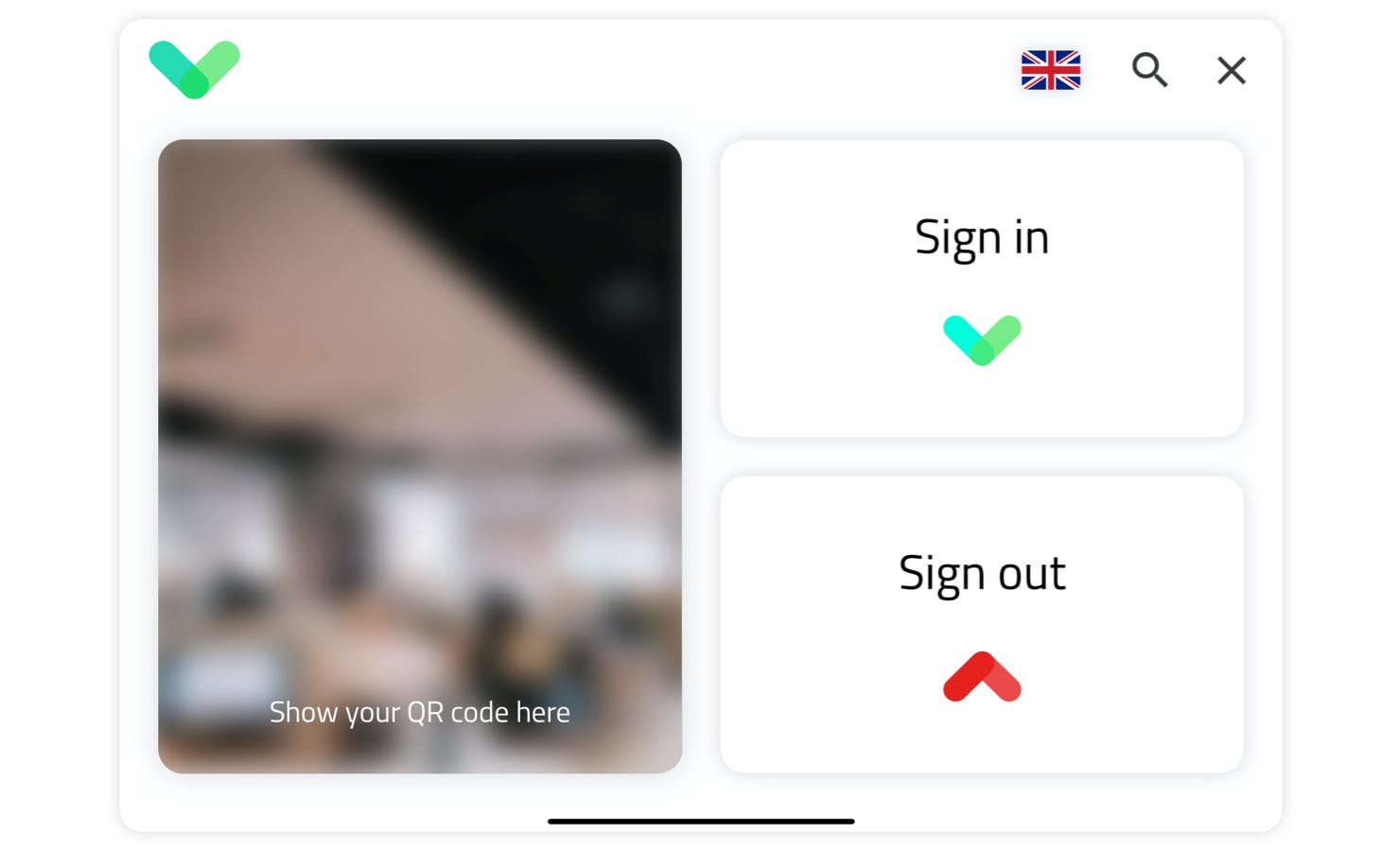
In speaking to our community every day, we get to know what causes confusion and prompts questions. One such question is why repeat visitor groups can’t use the big Sign In / Out buttons on the welcome screen. We heard you. In version 4 everyone can use the big buttons as the group selector appears after picking “Sign In”. It’s a small change that we hope will make a big difference to new users.
6. Back button
Another small change to help visitors is having the option to go back through each stage of the sign in process. It’s not unusual to miss some information or want to double check what you entered, so the new back button in version 4 will let your guests easily review and correct their sign in details.
7. Custom field appearance
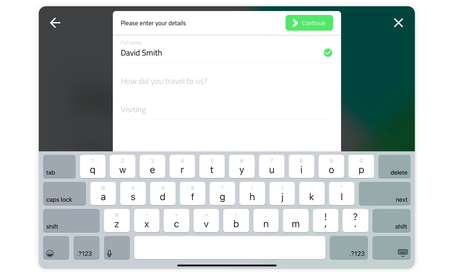
The custom field screen has been updated so the name of each field moves up as the guest starts typing. This means the names of the fields remain visible on the screen, preventing any issues with pre-registrations where information entered ahead of the visit would appear with no field name.

8. Autocomplete
For standard visitors who sign in frequently, Sign In App has an autocomplete option which populates the first two fields when signing in to the same iPad. In version 4 this has been expanded to remember all fields and work across all iPads on site. No data is stored on the iPad as the new autocomplete feature works solely from the cloud.
9. Message changes
The messages screen has been tweaked to fit more text on screen, resulting in less scrolling for the guest signing in. The font is clearer and easier to read, and signatures now require guests to scroll to the bottom of the message content before signing their name.
10. Video / document messages
Version 4 also introduces support for PDFs, images and videos to accompany your messages, giving you more options than ever for presenting important safety information, site information or brand messaging. Documents and images appear in their original format, allowing guests to scroll through their content just as they would a standard message. Videos autoplay with a progress bar, offering an exciting new way to engage with your guests.
11. Evacuation points
You can now make evacuation points part of your sign in process, showing a photo and interactive map to the relevant evacuation point just after the messages section. Repeat visitors such as staff only see the evacuation point assigned on their first visit.
12. Cancel screen
We all know what it’s like to be making conversation while signing in, only to find you’ve taken too long and the sign in screen has timed out. A new cancel screen appears automatically in version 4 just before it times out and returns back to the welcome screen. This cancel screen gives the guest the opportunity to resume their sign in, or confirm they wish to cancel (preventing accidental cancellations too).
13. New sign in experience
While all of the changes we’ve covered so far enhance how Sign In App currently works, the optional ‘new sign in experience’ gives you the opportunity to try a new way to sign in. Our team has reimagined the sign in process to make it even more streamlined with improved privacy for guests and staff. The app looks different too with a ‘light’ theme of white backgrounds, drop shadow buttons and your logo displayed more prominently throughout. The new sign in experience was designed around regular visitors, contractors and questionnaires and can easily be switched on or off from the config screen.

14. Video welcome screens
One exciting feature exclusive to the new sign in experience is support for video welcome screens. With the new sign in experience enabled, you can upload a short video to be played on a constant loop, welcoming guests as they arrive. This video plays without sound, giving you an opportunity to present an engaging, visual introduction to your site.
15. Alternative custom field appearance
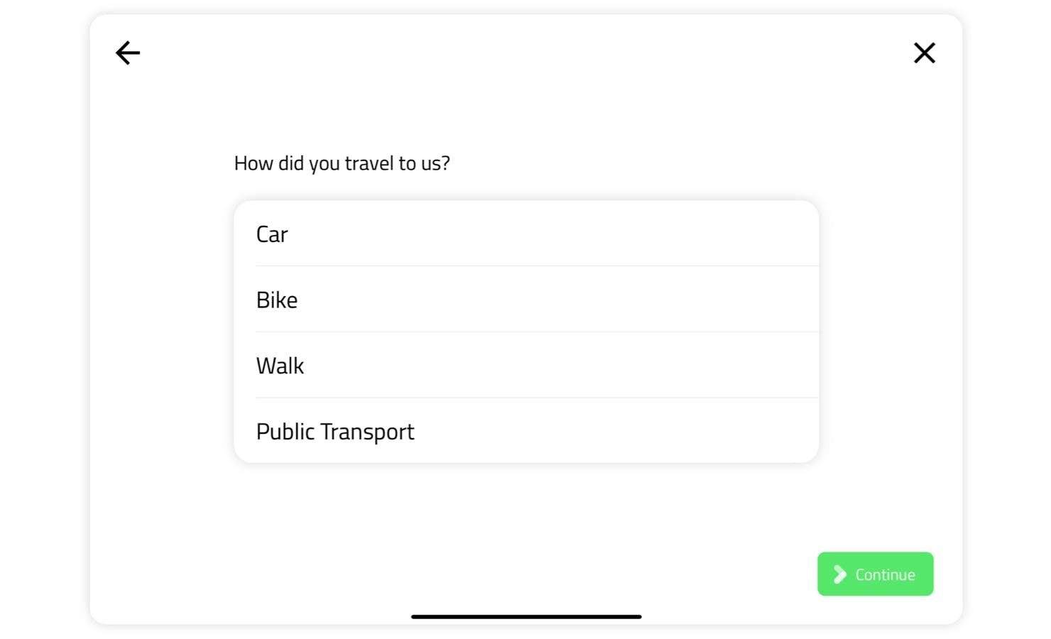
The new sign in experience changes how custom fields appear with each field showing on its own screen, allowing for larger fonts, longer field names and clearer dropdowns options. Tapping ‘Next’ guides the guest through each field making the new layout ideal for longer and more complicated sign in processes.

16. Connect multiple sites
When you’re running an event, you may want to use the iPad from your reception to sign guests into both your site and your event. With multi-site mode in version 4, you can connect both your site and your event to the same iPad, presenting guests with the option to sign into either when they arrive. The multi-site features in version 4 will also enable our multi-tenancy features set to be announced soon.
That’s not all...
While these are the headline changes, there are lots of other tweaks both ‘under the hood’ and visible to guests. These include;
17. Language picker
The language picker has been updated to include the native language name as well as the flag, improving support for countries with multiple languages and languages across multiple countries.
18. Clock style
The clock on the welcome screen now appears without the white background, allowing you to select either dark text or white text depending on your background image or video.
19. Updated repeat visitor screens
The repeat visitor screens where you can send an invite to companion app, print a badge or take a new photo, have also been updated with icons and descriptions for each option.
20. Last person message
If you’re the last person to sign out of a repeat visitor group, a message appears on the sign out message letting you know.
We hope you enjoy using version 4 and we’re excited to hear your feedback around the new features and ideas for the future. If you have any questions or concerns, please reach out to us at support@signinapp.com or start a live chat online and the team will be happy to help.